Inequality on the C&O Canal
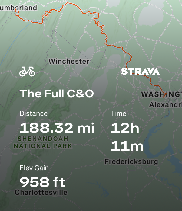
I recently biked the entirety of the C&O Canal from Cumberland, MD to Washington, DC. Fourteen hours of solitude gives someone a long time to think, and one of the things I thought about that day was the distribution of locks along the canal. Over the full 184.5 miles, there are 74 lift locks, numbered 1 through 75*, that were used to raise and lower boats a total of 605 feet. If the slope of the Potomac River (and hence the canal) were constant, one would then expect a lock about every 2.5 miles. But that’s not the case, and as you navigate the canal, you notice that they tend to come in clusters. For instance, there’s a closely spaced (all within less than a mile) group of six locks as the canal passes alongside Great Falls. And further upstream, there’s a group of four locks next to a 14-mile gap. So, I wondered if there was a good metric to quantify this apparent inequality.
Econ 252
Going back to economics class, the Gini coefficient comes to mind as a viable metric. Though it’s typically used for measuring income or wealth inequality, I don’t see a reason why it wouldn’t be a viable metric here as well. In typical usage, a Gini coefficient of 0 reflects perfect equality, where all income or wealth values are the same. In the opposite extreme, a Gini coefficient of 1 reflects maximum inequality, where a single individual has all the income or wealth, and everyone else has none. For our canal example, since we’re thinking about the gaps between the locks, a value of 0 would represent perfectly evenly spaced locks, whereas a value of 1 would occur if all the locks were clustered at one end or the other*.
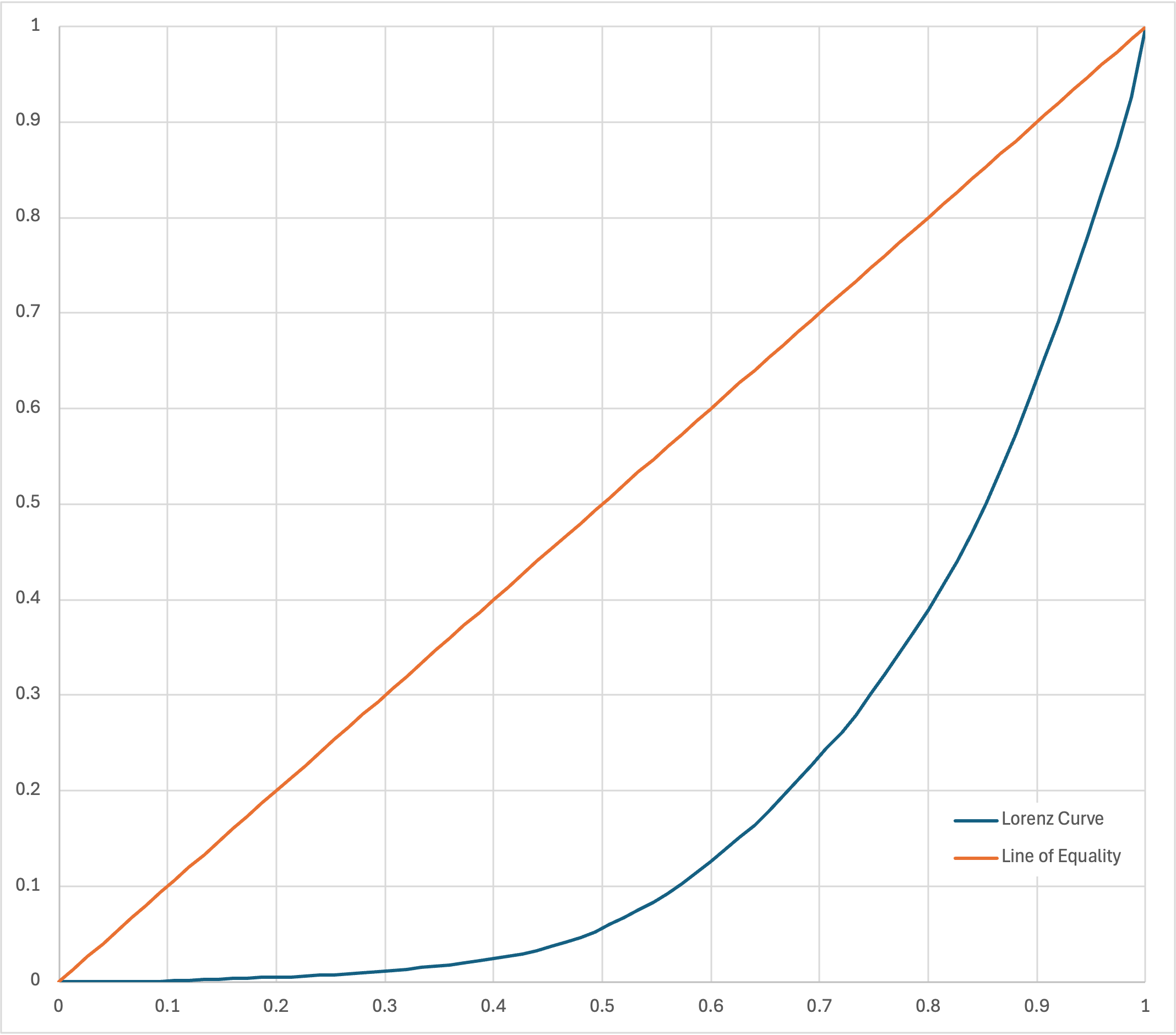
I’ll defer to other sources for deeper explanation of the Gini coefficient and the associated concept of the Lorenz curve, but the math is very straightforward. To start, I copied the list of locks and their locations into Excel from the ridiculously detailed Wikipedia article. Including the ends of the canal, I subtracted the locations of the locks from one another to get the gaps. (Note, multiple locks cannot share the absolute same location, but many of the listed values only have precisions of tenths of a mile, in which case locks that are 500 feet apart may still have the same value.) These 75 gaps were then sorted from smallest to largest and their cumulative sums were taken and divided by 184.5 to be in the range of 0 to 1. If you plot these against x-axis values of 1/75, 2/75, etc., you get the Lorenz curve, as seen below. The area between this curve and the “line of equality” (y=x), divided by the total area under that line (0.5) is then the Gini coefficient. In our case, it’s easiest to calculate the area under the Lorenz curve as the summation of a series of trapezoids, and the coefficient equals
\[1 - 2 \times \text{Area Under the Curve}\]Excel gives that final answer to be 61.3%. For comparison, the World Bank calculates that South Africa has the highest income inequality in the world with an index of 63.0%, Slovakia with the lowest at 24.1%, and the United States at 41.8%. It would be interesting to compare this Gini coefficient for the C&O Canal with other canals around the world, but at least for now, my curiosity has been satisfied.
Order Up
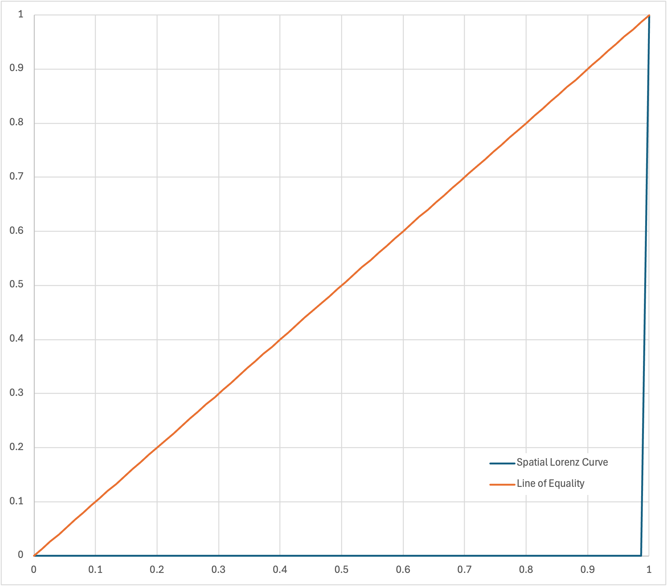
Except that doesn’t feel quite right. A canal is linear. Its features are encountered in a specific, unchanging order. It’s not a group of people that can be sorted. If there existed a canal with all of its locks clustered at just one end and then another canal with half of its locks clustered at each of the ends, the gaps would be the same, and so would the Gini coefficient, even though the latter would intuitively feel more fair, more equal than the former. So, let’s leave things unsorted then, and I’ll use the terms “spatial Lorenz curve” and “spatial Gini coefficient” to differentiate this approach. Let’s look at some of these curves. If all the locks are clustered at the start, we’d see something like the following.
If they were clustered at the end, the spatial Lorenz curve would be flipped, but with the same area between it and the line of equality.
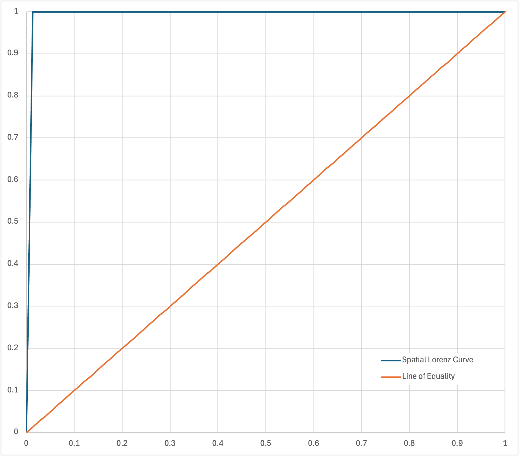
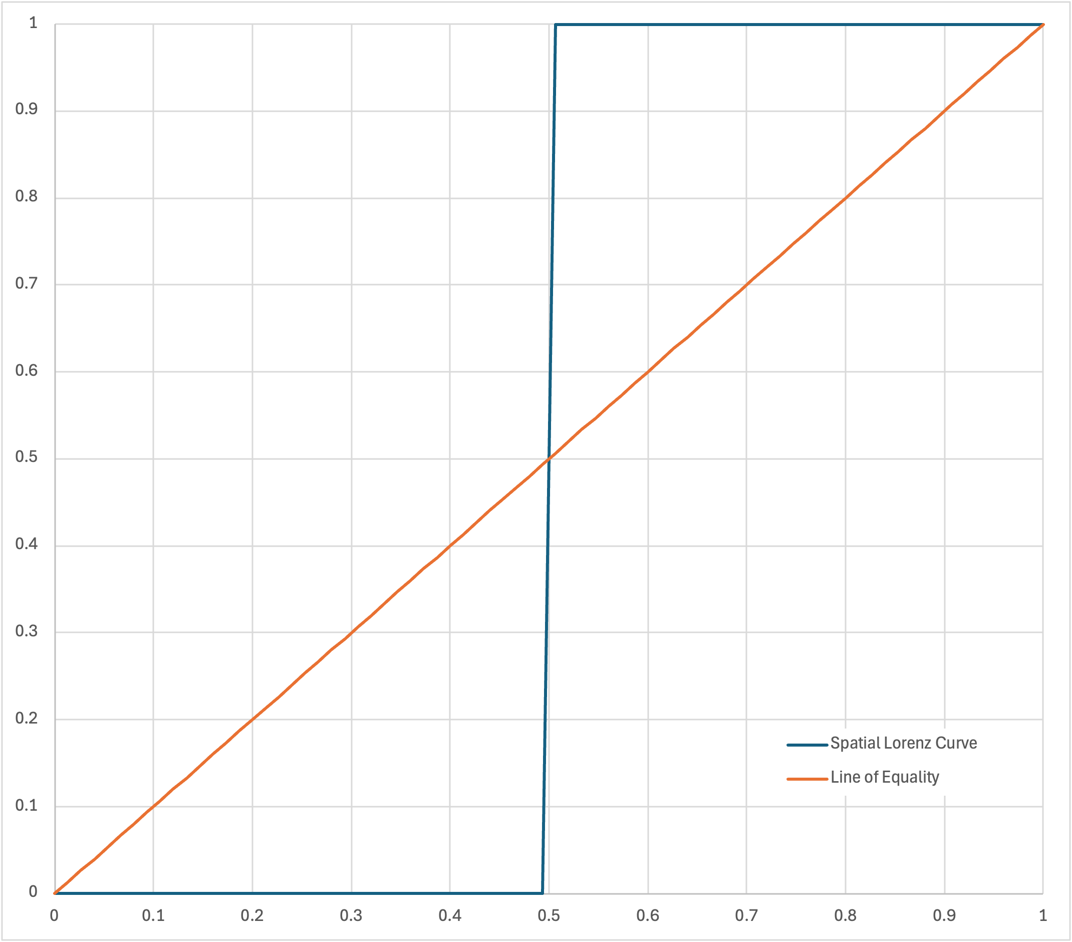
The area between the curves, times 2, gives us our spatial Gini coefficient of 100% for both these cases: maximum inequality. It’s expected that this result should be symmetric, as the direction you traverse the canal is arbitrary. Looking at the curve for the example where half of the locks are clustered at each end, we see two smaller triangles, giving a spatial Gini coefficient of 50%. Great, so our desired outcome of this scenario showing a result as being more equal than the prior two is true.
Here’s the spatial Lorenz curve for the actual C&O Canal. We can see how it starts off relatively flat, given the density of locks leaving Georgetown and through Great Falls. Then we see a big gap, another cluster, and another gap before settling near the line of perfect equality. Finding the area between the lines, we get a spatial Gini coefficient of about 14.4%
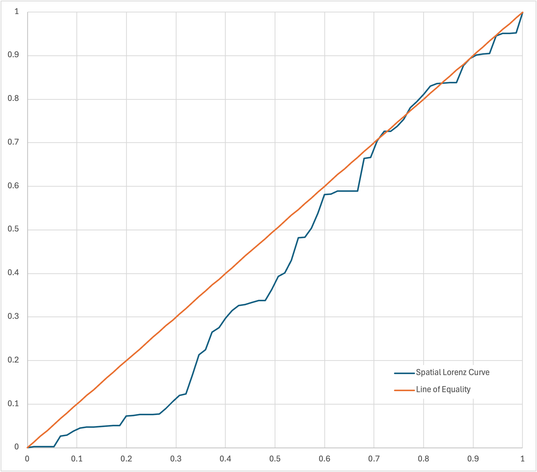
This feels a bit better than the original answer. It might not be a perfect random walk, since there are larger geographic trends at play, but in many real-life examples, I’d expect that the spatial Lorenz curve never gets too far away from the line. So, the spatial Gini coefficients of various canals may not have a large spread of values, but it would still indicate which canals have a more equal distribution of locks.
Try, Try Again
Except, this answer again doesn’t fully satisfy me, since for instance, a section might be relatively fair, but because of inequalities on either side of it, it may add a lot of area between the curves. For a specific example, take a look between 0.4 and 0.5 on the x-axis of the above chart. Over that segment, the average slope is indeed 1, the same as the y=x line of perfect equality, but because it’s about 0.1 below that line on the y-axis, it still penalizes the final results. Given this, I’ve wondered if a slope-based metric might make the most sense, like something based on the standard deviation of the slopes of each segment. Given that each slope is just the segment gap divided by the mean gap, this would basically be the coefficient of variation, which here is the standard deviation of the gaps, divided by the mean gap. In our case, it’s about 1.2. But that result – like the original Gini coefficient – ignores the sequential nature of things altogether; randomly shuffling the gaps would give the exact same value.
So, what’s a curious cyclist to do? Well, there’s the relative mean absolute successive difference, which as the name implies, averages the absolute values of the differences between subsequent gap lengths. So that’s a decent measure of the volatility in gap length, but it only works with a given gap’s next-door neighbors, rather than the full neighborhood. However, we can expand our area of influence by using a weighted distribution to include discrepancies in gap length not just from immediate neighbors but from gaps further away, with diminishing importance. Something like a triangular distribution could work, but that might overemphasize far-away gaps. Really, it’s all kind of arbitrary at this point, but a Gaussian (normal) distribution seems reasonable. For the standard deviation, well, that’s also fairly arbitrary (as long as it’s consistent when comparing different canals), but we can use a value of 2 to limit ourselves to the local neighborhood. Also, note that we’ll be squaring the difference between a given gap and its weighted neighbors to really penalize geographic whiplash, and we’ll divide by the squared mean gap to normalize by scale. Putting it all together with Python code like the following (since my Excel sheet was already ugly enough), we get a value of 14.9%.
import math

GAPS = (0.38, 0.04, 0.07, 0.05, 4.46, 0.4, 1.6, 1.33, 0.37, 0.09, 0.18, 0.32, 0.08, 0.1,
        3.98, 0.15, 0.39, 0.1, 0.08, 0.13, 2.34, 2.99, 2.49, 0.64, 8.04, 8.6, 2.1, 7.4,
        1.99, 4.11, 3, 2.23, 0.47, 0.87, 0.76, 0.11, 4.52, 5.69, 1.35, 5.41, 9.49, 0.14,
        3.92, 6.34, 7.97, 0.15, 1.38, 0, 0, 0, 13.79, 0.26, 7.15, 4, 0, 2.2, 3, 4.7,
        2.7, 3.1, 3.4, 1.1, 0.3, 0.1, 0.1, 7.1, 3, 1.6, 0.3, 0.3, 7.4, 1, 0.1, 0.1, 8.9)


def gaussian_points(n: int, sigma: float) -> tuple[float, ...]:
    """Return unnormalized Gaussian values for integer points [0, n]."""
    denominator = 1 / (2.0 * sigma * sigma)
    return tuple(math.exp(-(point * point) * denominator) for point in range(n + 1))


def weighted_squared_differences(gaps: tuple[float, ...], weights: tuple[float, ...]) -> tuple[float, ...]:
    """Per-gap weighted squared difference against all other gaps.

    Each score is normalized by the sum of the weights used for that gap.
    """
    results = []
    for i, gap_i in enumerate(gaps):
        total = 0.0
        weight_sum = 0.0
        for j, gap_j in enumerate(gaps):
            if i == j:
                continue
            distance = abs(i - j)
            weight = weights[distance]
            total += ((gap_i - gap_j) ** 2) * weight
            weight_sum += weight
        results.append(total / weight_sum if weight_sum else 0.0)
    return tuple(results)


def mean(values: tuple[float, ...]) -> float:
    """Return the arithmetic mean."""
    return sum(values) / len(values) if values else 0.0


def main():
    sigma = 2.0
    weights = gaussian_points(len(GAPS) - 1, sigma)

    scores = weighted_squared_differences(GAPS, weights)
    score_avg = mean(scores)
    mu = mean(GAPS)
    normalized_avg = score_avg / mu / mu
    print("mean-normalized average:", normalized_avg)

    unequal_gaps = (0,) * (len(GAPS) - 1) + (1,)
    unequal_scores = weighted_squared_differences(unequal_gaps, weights)
    unequal_score_avg = mean(unequal_scores)
    unequal_normalized_avg = unequal_score_avg / mean(unequal_gaps) / mean(unequal_gaps)
    print("unequal-normalized average:", unequal_normalized_avg)
    bounded_metric = (normalized_avg / unequal_normalized_avg) ** 0.5
    print("bounded inequality metric:", bounded_metric)


if __name__ == "__main__":
    main()
Here are some other notes/findings/explanations:
- This calculation is apparently similar to something called Geary’s C for measuring spatial autocorrelation. One difference, though is that that uses global variance as the denominator instead of the squared mean as I did.
- A perfectly equal canal would have a value of 0.
- A perfectly unequal canal (like the Gini coefficient) should have a value of 1. To normalize to this, I calculate and divide by the perfectly unequal result for a given N and standard deviation.
- I also take the square root of the final result to enlarge the magnitude of small values. This also has the effect of shifting things from a quadratic scale back to a linear one.
- If the gaps are sorted, the result is a value of 3.0%. This is the lower bound for the given set of gaps (and standard deviation), and it provides a reference for how rough the actual canal lock spacing is.
- With a small standard deviation of about 0.45, you basically are comparing the gaps only against their immediate neighbors, which gives an actual value of 15.5% and sorted value of 2.5%.
- As the standard deviation goes to infinity, this represents a global view of the canal: all of the gaps become equally weighted (smoothing out the local variation that this metric was designed to penalize), and both the actual and sorted values converge to 14.0%.
Okay, so I’ve finally found a metric that I’m satisfied with for measuring inequality on the C&O Canal. This has taken far too long, but now I can rest easy, at least until I decide to bike the Erie Canal.